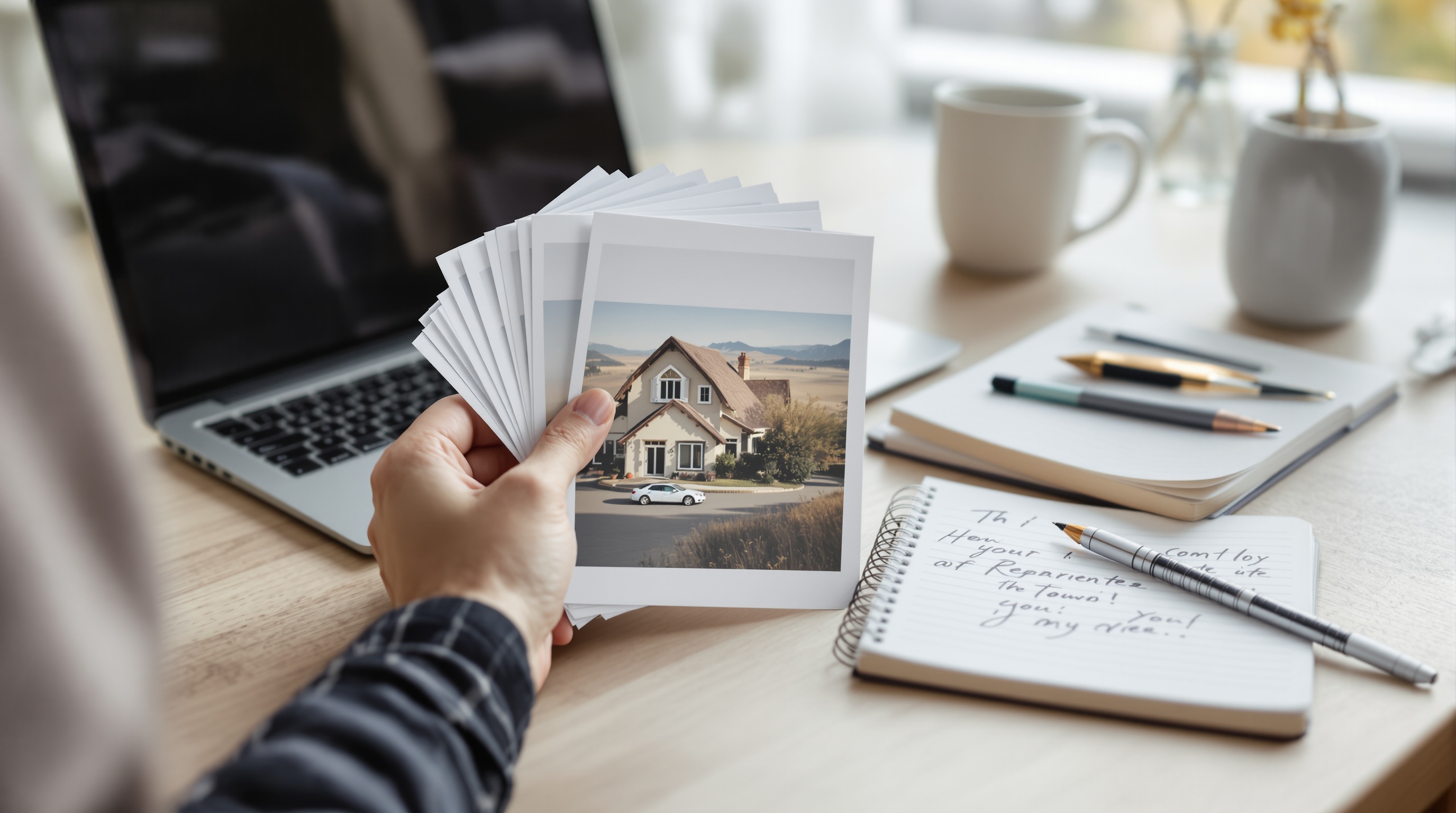
Direct answer: To create viral-ready AI images as a beginner, start with one clear concept, then run a 5-variation prompt loop (subject + setting + camera + lighting + one scroll-stopping hook). Score each output on clarity, novelty, and thumbnail readability, then iterate only the weakest attribute. In OmnyChat, you can A/B test the same prompt across multiple models in one workspace and keep the best result—without losing your prompt versions and scores across scattered tabs.
If you’re brand new to image generation in OmnyChat, use this quick primer first: AI image generation with OmnyChat (beginner guide).
Featured-snippet answer + what you’ll make in 30 minutes
Most “AI image generation” pages rank because they’re tool pages or broad roundups. That’s useful for picking software, but it doesn’t help you when you’re staring at a blank prompt box and you need an image that reads clearly in a feed.
This case study is built for that moment: you’ll start with one simple idea, produce five viral-ready variations, then A/B test and refine them using a checklist and a scoring rubric—so your results are repeatable, not luck.
At the end of 30 minutes you should have:
- One “hero” image that reads as a TikTok/Shorts thumbnail
- Two to three alternates that work as Instagram feed posts (or a carousel cover)
- A saved prompt stack you can reuse to create a series (Instagram carousel AI images, LinkedIn post visuals, or consistent thumbnails)
The 30-minute “Beginner’s Luck” workflow (time-boxed)
- Minutes 0–5: Pick one concept that’s instantly legible (one subject, one action, one hook).
- Minutes 5–10: Write your base prompt using the formula (subject + setting + camera + lighting + hook).
- Minutes 10–18: Generate 5 controlled variations (change only one variable per prompt).
- Minutes 18–24: Score each output with the rubric (clarity, hook, realism, platform fit).
- Minutes 24–30: Apply 1–2 “prompt patches” to the weakest score, then re-generate the top 1–2 candidates and export in platform aspect ratios.
The ‘Viral-Ready’ checklist (what actually makes an image shareable)
“Viral” is unpredictable, but “viral-ready” isn’t. Viral-ready means your image has the basic properties that help it survive the feed: it reads fast, looks intentional, and creates curiosity without confusing the viewer.
For beginners, the biggest unlock is accepting a constraint: you’re not trying to generate the most detailed picture—you’re trying to generate the most readable one at thumbnail size.
Checklist: 9 traits of a viral-ready AI image
- Single-subject clarity: one obvious focal point; the viewer knows what to look at instantly.
- One-sentence story: “A person doing X” or “An object in an unusual situation.”
- High-contrast read: clear separation between subject and background (value contrast or color contrast).
- Clean edges: minimal background clutter; avoid tiny objects everywhere.
- Strong silhouette: the subject shape is recognizable even when blurred or shrunk.
- Curiosity hook: one surprising prop, action, or juxtaposition (not five).
- Platform-aware framing: subject placed where UI won’t cover it.
- Photographic cues: camera/lens/lighting details that suggest “real capture,” not “render.”
- Series potential: the concept can become 5–10 posts without needing a totally new style every time.
Tradeoff to keep in mind: increasing “novelty” often hurts “clarity.” Beginners usually overdo novelty (too many surreal elements) and then wonder why the image doesn’t perform. In this workflow, you’ll deliberately keep novelty to one hook and use your rubric to decide whether to push it further.
The beginner prompt formula (copy/paste template)
Beginners get better results when they stop writing “poems” and start writing constraints. The prompt formula below is designed to prevent the three most common beginner issues: unclear subject, messy composition, and an “AI look” caused by vague style words.
Copy/paste prompt template (with beginner-safe defaults)
Use this as your starting point and fill the brackets. Keep it short on purpose.
[SUBJECT], [SIMPLE ACTION], in [SETTING]. [2–3 SUPPORTING OBJECTS]. Shot as a [CAMERA SHOT TYPE] with a [LENS/FOCAL LENGTH] look. [LIGHTING] with [TIME OF DAY] mood. Clean background, minimal clutter, strong subject separation, realistic textures. Composition: [CENTERED / RULE OF THIRDS], plenty of negative space. Hook: [ONE UNUSUAL DETAIL].
What each field does (and how to iterate without chaos)
Subject + action is where clarity comes from. If your image feels confusing, don’t add more details—make the action simpler. Example: “holding a mug” is easier than “making coffee while looking surprised while pointing at a calendar.”
Supporting objects are your hook delivery system. Pick 2–3 objects max. If you list 10 props, you’ll get clutter—and clutter kills thumbnails.
Camera + lighting is where realism comes from. You don’t need brand-name camera bodies. Just pick a shot type (close-up, head-and-shoulders, product shot, wide shot), a lens feel (e.g., “50mm look”), and a light direction (“soft window light from the left”). This reduces the “rendered” vibe for many models.
Composition makes it platform-ready. If you want a TikTok thumbnail, your default should be “centered subject, high contrast, minimal background.” For an Instagram carousel cover, you can afford more negative space because the user is already engaged.
Hook should be one detail, not a full surreal scene. Viral hooks that keep clarity: unusual scale (tiny/giant), unexpected material (glass fruit), odd-but-simple prop (rubber duck in a boardroom), or a strong visual metaphor (a melting ice cube next to a deadline sticky note—without needing readable text).
AI image style prompt examples (small “style lines” you can safely swap)
Beginners often over-style (“ultra cinematic hyperreal 8K masterpiece”) and accidentally destroy realism or clarity. Instead, keep a short style line you can swap while the rest of the prompt stays constant. That gives you clean A/B tests and faster learning.
Below are beginner-safe style lines. Use one at a time.
| Style line (add near the end of your prompt) | Best for | Beginner warning |
|---|---|---|
| “editorial photo, natural colors, subtle film grain” | LinkedIn visuals, IG feed posts that feel credible | Don’t combine with heavy “fantasy” terms; you’ll get mixed signals |
| “soft window light, realistic shadows, paper/fabric texture detail” | Making images feel less AI and more tactile | If clutter appears, reduce props before adding more texture words |
| “high-contrast portrait lighting, clean background, tight crop” | TikTok thumbnail readability | Faces become more important; reframe if your model struggles with faces |
| “top-down tabletop photo, clean grid layout, minimal objects” | Instagram carousel covers and repeatable series | Grids can drift; re-assert ‘neat grid’ and reduce object count |
| “product photo on seamless backdrop, softbox lighting, minimal reflections” | Simple hook objects, brand-like posts, clean comparisons | Avoid asking for text on products; add text later in design |
| “hand-drawn ink illustration, limited color palette, lots of negative space” | Carousels that need a consistent visual identity | Illustration can hide realism issues but may reduce “photo credibility” |
Case study setup: pick a concept that fits a feed (3 easy concept generators)
For this case study, we’re going to build a “viral-ready” concept that can work as: a TikTok thumbnail, an Instagram feed post, and a LinkedIn image (more conservative, less meme-y). The goal is not to guess what the internet will love—it’s to build a concept that scores well on the checklist and can be packaged for each platform.
Concept generator #1: “One ordinary scene + one impossible detail”
- Ordinary scene: tidy kitchen, office desk, subway platform, bookstore aisle.
- Impossible detail (choose one): object is made of the wrong material (ceramic banana), scale is wrong (giant paperclip), gravity is weird (floating coffee cup), time is visible (hourglass spilling sand onto a laptop).
- Keep the impossible detail physically simple—one object, one material, one twist.
Concept generator #2: “A visual metaphor for a common pain point”
This works well for LinkedIn and Instagram carousel covers because it’s instantly “about something” without requiring readable text inside the image. Example metaphors: burnout (candle melted onto keyboard), context switching (too many keys on one keychain), information overload (overflowing inbox made of paper).
Concept generator #3: “Before/after in one frame” (great for IG carousels)
If you want Instagram carousel AI images, design a cover frame that suggests there’s a story inside. A simple pattern is “left side chaotic, right side calm”—but you do it with objects and composition, not text. Example: messy desk vs tidy desk split by a clean line of light.
Our case study concept (simple, legible, series-friendly): “A creator reviewing five AI image variations like a photo contact sheet—one of them is strangely ‘too perfect.’”
This maps to the real posting workflow: you compare options, pick a winner, and the hook is the “too perfect” outlier that makes you look twice—without needing readable text in the image itself.
Case study: 1 idea → 5 variations (with exact prompts)
Below are five beginner-friendly prompts you can copy/paste. They’re intentionally similar. Each variation changes one variable so you can see what actually moves your scores (clarity, realism, hook, platform fit).
If you’re using OmnyChat, keep these as a “prompt stack,” then A/B test the same prompt across different models in the same workspace (we’ll cover the routine later).
Variation 1 (baseline): clean, photoreal, centered thumbnail read
A person at a tidy home desk reviewing a small spread of printed photo thumbnails, one hand holding a single photo. Laptop closed on the side, notebook and pen nearby, a coffee mug. Head-and-shoulders framing, centered subject, 50mm look. Soft morning window light from the left, neutral colors, realistic skin texture, natural shadows. Clean background, minimal clutter, strong subject separation, shallow depth of field. Hook: one photo print is oddly glossy and perfectly sharp compared to the others.
Why this works for beginners: it anchors the scene in physical objects (prints, notebook, mug), which often yields more believable results than abstract “digital” descriptions. It also avoids the hardest failure modes (tiny text, complex hand gestures, crowded backgrounds).
Variation 2 (stronger hook): swap the hook object, keep everything else
A person at a tidy home desk reviewing a small spread of printed photo thumbnails, one hand holding a single photo. Laptop closed on the side, notebook and pen nearby, a coffee mug. Head-and-shoulders framing, centered subject, 50mm look. Soft morning window light from the left, neutral colors, realistic textures, natural shadows. Clean background, minimal clutter, shallow depth of field. Hook: among the photo prints, one is a tiny square image made of clear glass instead of paper.
What changed: only the hook. This is a fast way to explore “how to make viral AI images” without turning the scene into surreal noise. If the glass print looks confusing, downgrade the hook: “one print has a mirrored surface” or “one print is slightly crumpled while the rest are perfect.”
Variation 3 (TikTok thumbnail bias): tighter crop + higher-contrast lighting
Close-up portrait of a person at a tidy home desk holding a single photo print up near their face, the other prints slightly blurred on the desk. Minimal background. Tight framing for a vertical thumbnail, centered face and photo. 85mm portrait look, shallow depth of field. Directional window light creating gentle contrast, natural skin texture, realistic shadows. Hook: the photo print they’re holding is perfectly sharp and glossy while everything else is matte.
This is your “TikTok thumbnail AI prompts” lever: crop tighter and simplify. The tighter you go, the more important faces become—so if you consistently get uncanny facial artifacts, switch back to Variation 1 or 4 (less face prominence) and rely on the object hook instead.
Variation 4 (Instagram carousel cover): more negative space + cleaner geometry
Top-down editorial photo of a tidy desk: a neat grid of five photo prints laid out like a contact sheet, a closed laptop in the corner, a notebook and pen, a coffee mug. Minimal clutter, clean lines, generous negative space. Soft morning window light, neutral tones, subtle film grain. Hook: one photo print in the grid is slightly reflective and looks unusually perfect compared to the rest.
Why this is good for Instagram carousel AI images: top-down “tabletop” scenes are easier to keep consistent across a series. Next carousel posts can swap the five prints for five other “variations” while keeping the same desk, lighting, and layout—your feed looks cohesive without requiring perfect character persistence.
Variation 5 (LinkedIn-friendly): calmer “work artifact” metaphor, less gimmick
Editorial photo of a tidy work desk with a printed contact sheet of small photo thumbnails, a simple pencil, and a notebook. No screens. Soft natural light, neutral colors, realistic paper texture. Clean composition with negative space. Hook: one thumbnail on the contact sheet looks subtly too perfect and glossy, creating a quiet “which one is different?” feeling.
LinkedIn tradeoff: stronger hooks can hurt credibility. For LinkedIn visuals, bias toward “quiet curiosity” instead of absurdity. Your caption can deliver the punchline; the image just has to stop the scroll long enough for the first line to land.
Iteration loop: how to fix the 6 most common failure modes (hands, text, faces, clutter, lighting, composition)
Prompt iterations for better AI images work best when you treat problems like categories. Don’t “try again” randomly. Identify the failure mode, apply a specific patch, and re-generate.
If you do that 2–3 times and the same failure persists, that’s your signal to switch models (we’ll turn this into a simple decision rule in a minute).
How many prompt iterations should a beginner expect?
It varies by model and concept, but a beginner-friendly expectation is: 3–7 prompt revisions to reach “postable,” and 10–30 total generations when you include your five-variation loop plus a couple of re-runs for the best candidates.
If you’re pushing a difficult element (hands doing something complex, multiple faces, tiny objects, or any text inside the image), the number goes up. The workflow here keeps the concept physically simple so your iterations stay low.
1) Hands look wrong
Hands fail most when they’re doing complex gestures or interacting with multiple objects. Beginner fix: make hands boring.
Prompt patch options you can add at the end: hands out of frame, one hand holding a simple mug, hands in pockets, fingers not visible. If your concept requires hands (e.g., holding a photo), prefer one hand, simple grip, and avoid “pointing.”
2) Text is garbled or unreadable
If you need text, add it later as an overlay in your design tool. For “viral-ready” images, the safest approach is: no readable text inside the generation.
Patch: no text, no letters, no logos, no watermark. If you want the idea of text (like a contact sheet), ask for “blank boxes” or “unreadable scribbles,” but expect mixed results across models.
3) Faces look uncanny
Two beginner strategies: (a) reduce face prominence (top-down scenes, back-of-head angles), or (b) increase photographic constraints (lens + lighting + “natural skin texture”).
Patches: natural skin texture, slight imperfections, subtle film grain, soft directional light. If you still get uncanny faces after two patches, reframe the concept so the face isn’t the hero element (e.g., focus on desk layouts or over-the-shoulder angles).
4) The scene is cluttered and messy
Clutter usually comes from long prop lists and vague settings (“a busy office with lots of things”). Fix: limit props to 2–3 and explicitly ask for clean negative space.
Patches: minimal clutter, plain background, only three objects on desk, clean composition with negative space. If the model keeps adding objects, remove all props and re-add them one at a time in later iterations.
5) Lighting looks fake or flat
Beginner patch: choose one light source and a direction. “Soft window light from the left” is a workhorse. Add time-of-day mood and shadow realism.
Patches: soft window light from the left, natural shadows, gentle contrast, no harsh studio lighting. For a more cinematic feel (sometimes better for TikTok), try: single practical lamp, warm highlights, cool shadows—but keep everything else simple so style doesn’t overwhelm readability.
6) Composition doesn’t read at thumbnail size
If it looks fine full-size but fails when small, the subject is too small or too similar to the background. Fix: specify framing and subject scale.
Patches: centered subject, fills 60% of frame, strong subject separation, simple background, high contrast. For TikTok thumbnails, “tight crop, one focal point” wins more often than “wide scene with details.”
Comparison table: prompt versions + evaluation criteria + when to switch models
A/B testing only works if you can explain why you picked a winner. The rubric below is simple enough for beginners, but specific enough to guide action. Score each image 1–5 in each category.
Then apply the decision rule: iterate if one category is low and fixable; switch models if repeated failures persist after targeted patches.
The beginner scoring rubric (1–5 per category)
- Clarity (thumbnail read): Is the subject obvious in 1 second?
- Hook (curiosity): Is there exactly one “wait, what?” detail?
- Realism (less AI look): Do textures and lighting feel photographic?
- Composition: Is there clean subject separation and negative space?
- Platform fit: Does the framing work for TikTok 9:16 vs IG 4:5 vs LinkedIn?
| Prompt version | Primary platform target | What changed (one variable) | Clarity (1–5) | Hook (1–5) | Realism (1–5) | Action if score is low |
|---|---|---|---|---|---|---|
| Variation 1 (baseline) | LinkedIn / IG | Baseline formula | __ | __ | __ | If realism low: add lens + light direction; if clarity low: simplify props |
| Variation 2 (hook swap) | IG / TikTok | Hook object only | __ | __ | __ | If hook confusing: downgrade hook to simpler material/scale change |
| Variation 3 (tight portrait) | TikTok | Crop + contrast | __ | __ | __ | If face uncanny: reduce face prominence or switch to top-down composition |
| Variation 4 (top-down grid) | Instagram carousel cover | Camera angle only | __ | __ | __ | If composition messy: explicitly ask for clean grid, fewer objects |
| Variation 5 (calm editorial) | Tone only | __ | __ | __ | If too boring: add one subtle hook (reflection, mismatch texture) |
Decision tree: when to revise the prompt vs when to switch models
- If clarity is low (you can’t describe the image in one sentence): revise the subject/action and remove props. Don’t switch models yet.
- If composition is low (subject too small, busy background): revise framing and ask for negative space. Don’t switch models yet.
- If realism is low (plastic texture, weird lighting): revise the camera/lighting/texture lines. If realism improves after 1–2 patches, keep iterating.
- If the same anatomy/face failure repeats after 2–3 targeted patches: switch models (keep the rest of the prompt constant so it’s a fair test).
- If you’ve made 3 focused revisions and your rubric scores don’t improve: switch models or simplify the concept (hard concepts can’t be “adjectived” into working).
Multi-model A/B testing inside OmnyChat (workflow, not pricing claims)
OmnyChat is positioned as an all-in-one AI workspace where you can use multiple models in one place. For beginners, this matters because you can separate the work into roles: one model drafts variations, another critiques for platform fit, and you keep your rubric scores and “winner” prompts organized in the same workspace.
If you want the broader concept of assigning different models different jobs, see: multi-model AI workflow.
The OmnyChat routine: ideate → vary → critique → score → patch
- Create a “Base Prompt” note: store Variation 1 as your control.
- Ask Model A for five one-variable variations: instruct it to keep everything identical except the hook (or crop, or lighting).
- Ask Model B to critique for platform fit: “Which version reads best as a TikTok thumbnail at small size? Which is best for an Instagram carousel cover? Which is best for LinkedIn? Explain why in one sentence each.”
- Generate images for the top 2–3 prompt versions and apply the rubric scores.
- Patch the lowest category: if clarity is 2/5, tighten framing; if realism is 2/5, add lighting/texture constraints; if hook is 2/5, simplify the hook object.
- Re-run only the patched versions (don’t regenerate everything) and choose a winner per platform.
If you want a structured way to record scores and decisions (especially when comparing outputs across multiple models), adapt this: AI model comparison template. You’re essentially doing the same thing here, but the “task” is viral-ready image output quality instead of writing or analysis.
A/B testing tip: keep a constant “control” prompt
When beginners say “Model X is better,” they often changed the prompt at the same time—so the comparison isn’t real. Keep Variation 1 unchanged as your control. Test the same control prompt across models. Then test your best-performing variant across models.
That gives you two clean answers: (1) which model handles your baseline style best, and (2) which model responds best to your iteration style.
Export/cropping guidelines for TikTok, Instagram, LinkedIn
A strong image can still fail if it’s packaged wrong. The easiest beginner win is to generate with a “safe” composition (centered subject, negative space), then crop for each platform.
Avoid baking text into the generation; instead, leave space where you can add overlays later if needed.
| Platform use | Aspect ratio | Common export size | Beginner composition rule |
|---|---|---|---|
| TikTok / Shorts thumbnail-first visuals | 9:16 | 1080×1920 | Subject fills frame; one focal point; high contrast |
| Instagram feed post | 4:5 | 1080×1350 | Center subject; leave margin for UI; keep backgrounds clean |
| Instagram square (optional) | 1:1 | 1080×1080 | Works best for simple objects or top-down scenes |
| LinkedIn feed image (general) | 1.91:1 or 1:1 | 1200×627 or 1080×1080 | Lower visual noise; editorial lighting; credibility over gimmick |
TikTok / Shorts (thumbnail-first)
- Aim for a strong 9:16 crop with the subject filling the frame.
- Prefer one face or one object; avoid multi-person scenes for your first attempts.
- Leave clean space near edges; app UI can cover corners.
- If you add overlay text later, keep the generated image simple so the text has contrast.
Instagram feed + carousels (cohesion matters)
- For feed posts, 4:5 is a common go-to because it’s tall enough to hold attention without being full-screen vertical.
- For carousels, keep a repeatable layout (e.g., top-down desk grid) so your series feels intentional.
- Use the same lighting description across a series to reduce “randomness.”
- If your concept is “5 variations,” save the best image as the cover, then place alternates as slides 2–5.
LinkedIn (editorial, credible, low-noise)
- Choose calmer hooks (subtle mismatch, quiet metaphor) over loud surrealism.
- Keep backgrounds plain and props minimal; it reads more “real” and less like a gimmick.
- If your post makes a professional claim, make the image supportive, not exaggerated—let the caption carry the argument.
Save your prompt stack: naming, versioning, and reusing for a series (consistency without pain)
Going viral once is nice; building a repeatable series is better. The simplest “beginner consistency” approach is not to rely on perfect character persistence—it’s to rely on repeatable scenes (same setting, props, camera angle, lighting) and rotate the hook.
A simple naming convention (so you can actually A/B test)
Use a short naming scheme tied to your one-variable rule. Example:
DeskContactSheet_v1_baseline, DeskContactSheet_v2_hook_glassPrint, DeskContactSheet_v3_crop_tightPortrait, DeskContactSheet_v4_angle_topDown.
When you store these in OmnyChat, you can quickly see what changed without re-reading the whole prompt.
Can you recreate the same character/style consistently? Yes—here’s the beginner version
Character consistency is advanced (and model/tool dependent), but beginners can still get “series consistency” by controlling what you can: keep the same setting, wardrobe description, camera angle, and lighting line.
Example patch you append to every prompt in the series: same tidy oak desk, same neutral wall background, soft morning window light from the left, 50mm look, natural colors. Then you vary only the hook object or the layout of the prints.
If you do need the same character across multiple images, the most reliable beginner move is to reduce facial prominence (over-the-shoulder, top-down, partial profile) so small variations are less noticeable—while keeping scene and prop cues constant to preserve identity.
FAQ: beginner viral AI image prompting (PAA-style)
What prompt should I use to make viral AI images as a beginner?
Use a simple template that forces clarity: a single subject + a simple setting + a camera cue + lighting + one scroll-stopping hook. Start by generating 5 variations where you change only one element (hook, camera, setting, prop, or style). Then score each result for thumbnail readability, clarity, and realism—and iterate only the weakest category.
How do I generate multiple strong variations from one idea?
Lock the core concept (subject + setting + intent), then run a controlled variation loop: create 5 prompts where each prompt changes exactly one variable (for example: hook prop, camera focal length, lighting mood, composition, or style line). This gives you comparable outputs and makes it obvious which lever improved the result.
How do I make AI images look less ‘AI’ and more like real photos?
Remove “AI-y” ingredients (busy scenes, overly perfect skin, random props), add physical constraints (lens look, natural light direction, shallow depth of field, slight grain), and simplify composition (one subject, 2–3 supporting objects, clean background). If the model keeps producing plastic textures, reduce stylization terms and add specific material cues (paper grain, fabric weave, fingerprints, minor scuffs).
What do I do when the image has weird hands/faces or messy composition?
Treat it like debugging: (1) reduce hand complexity (hands out of frame, one hand holding a simple object); (2) simplify the scene (fewer props, plain background); (3) lock framing (centered, head-and-shoulders, negative space); (4) re-generate only after applying one targeted patch. If the same anatomy or face issue persists after 2–3 targeted patches, switch models or reframe the concept so faces/hands aren’t the hero element.
Should I switch models or keep iterating the prompt? How do I decide?
Keep iterating when the concept is strong but one attribute is weak (lighting, clutter, composition) and your score improves after each patch. Switch models when the same failure repeats after 2–3 targeted patches (hands/faces keep breaking, style instructions are ignored, or your rubric score plateaus). A quick rule: if the score trend is upward, stay; if it flatlines, switch.
What aspect ratio and composition works best for TikTok thumbnails vs Instagram posts?
For TikTok, prioritize 9:16 with a large, simple subject and strong contrast so the first frame reads instantly. For Instagram feed posts, 4:5 is a common sweet spot; for carousels, keep a consistent layout and leave breathing room near edges for UI overlays. For LinkedIn, use a calmer, more editorial crop with clear subject separation and less visual noise (often square or landscape depending on your post type).
Can I recreate the same character/style consistently across multiple images?
Yes—beginner-friendly consistency comes from locking what you can control: the same setting, wardrobe, camera angle, and lighting line, then varying only one element (like the hook object). If you need tighter character consistency, reduce face prominence (over-the-shoulder, top-down, partial profile) so small differences are less noticeable while your scene cues stay consistent.
Create, iterate, and A/B test your prompt stack in one OmnyChat workspace
If you want a repeatable workflow (instead of random retries), use OmnyChat to draft prompt variations, critique them with a second model, and keep your scoring notes and winners organized. Start with one concept, run the 5-variation loop, then export platform-ready crops.